I’ve moved this site to www.revelutions.com
Site Moved to www.revelutions.com
Reply
I’ve moved this site to www.revelutions.com
I created a weekly paper from a list of the most influential CEOs on twitter. You can view the paper or subscribe here.
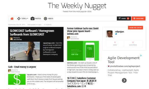
The Weekly Nugget
The festival season has started in India (and Southeast Asia). This year Dassera is on October 14th, followed by Diwali on November 2nd, which brings us close to the end of the year(?). In Singapore around this time of the year, retailers start advertising ‘DeepaRaya’ specials. DeepaRaya is a combination of Deepavali (also known as Diwali) and Hari Raya (also know as Id – English pronounciation – eedh). Despite any claims by Indians about inclusiveness to other relegions, a word created out of the combination of Diwali and Id would start a holy war in most of the world. Does that mean Singapore/Malaysia/Indonesia are the most secular nations? I am not so sure. I think a few sales guys came up with this name and it stuck.
I created a visualization of the Hindu population in the countries of the world. Also take a look at my previous post on Muslim population in the world (I’ll combine the two soon).
Click on the image to view the actual visualization.
Remember to click on the images to visit the interactive visualizations. If you would like to create a visualization for a list of politicans in your country/part of the world, let me know.

US Congress twitter followers
The next chart shows the number of tweets from the various members of Congress

US Congress number of tweets
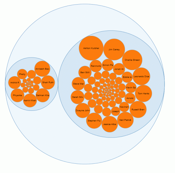
This is a followup on my previous post on Bollywood tweeters. How do you know if Bollywood is popular – compare to Hollywood.
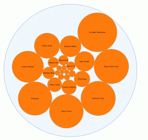
Most popular tweeter in bollywood
If you enjoy reading about Bollywood, take a look at my weekly archive of tweets from Bollywood. Guess whose tweets are the most popular (different from the graphic in this post).
or Email
Subscribe to The Weekly Dialog – Popular Tweets from Bollywood by Email
Disparaging or pretentious comments about Bollywood won’t find much support here.
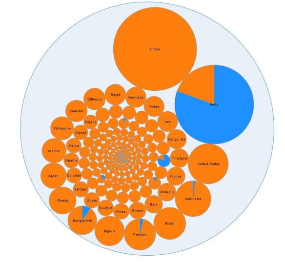
While meeting a few colleagues over dinner, a visitor to Singapore asked if Ramadan was followed by many people in Singapore. Here is a visualization to help answer that question. Note that this data is from the CIA World Factbook. A lot of the data is not current. However, the percentages are probably representative. Do let me know if there are any mistakes in my data.
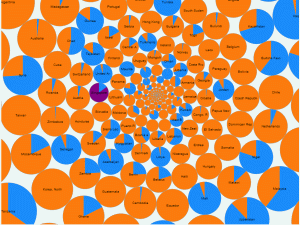
Percentage of Muslims in all countries
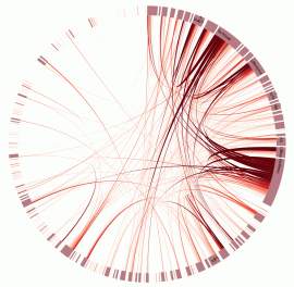
In my last post I mentioned that the chord diagram wasn’t as useful as the matrix diagram to view the entire set of twitter interactions in a conference. I made a few changes to the diagrams since then.
I removed the tweeters with 1 or 2 tweets (this may not be a good idea – more on that in a future post). I also used different shades of the same color for the chords (darker colors indicate more tweets). With these changes, the difference in the two conferences is much more visible.
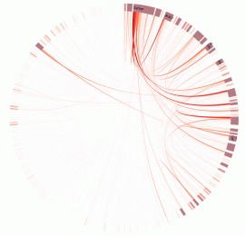
I also made some modifications to the matrix diagram. I was again trying to find a way to easily compare two conferences. See the images below. You may be able to view the visualizations side-by-side in browser windows.


I’ll be posting some more data on these two conferences in a future post. Let me know if you think the visualization helps to compare the interactions in the two conferences.
Remember to click on the images to see the actual visualizations.
I have been analyzing/gathering tweets from conferences. Sometime back I saw tweets from a conference which had a lot of healthy interaction. In this post I attempt to visualize the interaction among participants of a conference based on their tweets.
Note that the focus in this post is more on the visualization technique. It is not on reaching some definite conclusions about social networks – there is a lot of data to analyze and the data needs cleaning up before you can make definite inferences.
Some of these graphics are complex and pretty. It is important not to let that influence your opinion of the value they convey.
I used d3js for visualization. I have substituted the original names with fictitious names in the visualization. Remember to click on the images to view the actual visualization.
I started by visualizing all the interactions in a conference. This produced the hairball shown below. You can move your mouse over the chords to see the influencers and to see who they interact with. I then created a visualization of another conference to compare. The first conference had roughly double the tweets and it may not be a fair comparison. I am not sure if this is good enough to conclude that the first conference had more or better interaction.


I then used another technique, a matrix diagram (also called adjacency matrix), to visualize tweets (from Mike Bostock’s post). When you view the conferences in the matrix diagram the differences are much more visible (you may have to zoom in using the browser). The first conference has more tweets. There are also more tweets of a darker colour – darkness indicates a larger number of tweets. (Note that this could be a symptom of the size of the conferences.)


You can extend the visualization to other subsets of the data. I created some for tweets which were replies. This is equivalent of a smaller subset of the original data. As with the entire dataset, the matrix diagram shows a clearer view of the interaction. The chord diagram is prettier, but it’s difficult to characterize the entire set of interactions by looking at the diagram.


You could extend the analysis to a subset of participants, e.g., based on age/experience.
In both diagrams tooltips show the number of tweets. You should be able to figure out the tweets to and from a pair of participants. The chord diagram is better to see all the activities of a single participant. The matrix diagram is better for a view of the entire set of communications. The matrix is also good if you want to see the interactions between a specific pair of participants.
If you are interested in performing similar analysis for a social network and need some help feel free to let me know.
Placeholder post for my popular tweets from #seconf – annual conference on Selenium